Beautiful is not automatically playable
A cinematic image is not enough. Interactive objects must remain readable against the background, and doors and travel directions must still be clear on a narrow mobile screen.
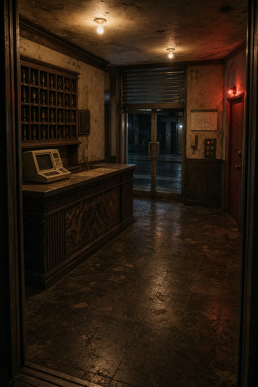
In the front lobby, the key rack, intercom, evacuation plan, and number panel were given separate hit areas matched to the intended objects.
Showing state changes
Before-and-after images keep the same composition so players can identify what changed. When a shutter rises or a cabinet opens, the new state should feel embedded in the original space rather than pasted over it.
We tested short animated transitions, but removed them when their visual continuity was weaker than the still image. Motion is reserved for moments where sound and a clean state change can preserve the atmosphere.
Mobile-first review
A wide wiring board that works on desktop must remain understandable without horizontal scrolling. We rebuilt it as a three-stage vertical flow while preserving the tactile action of dragging a colored cable into a socket.
Design the image and hit areas together
The background and its interactive areas need to be designed together. Handles, drawers, and number panels must remain recognizable within the image, and each target should match the object the player intends to select. Small keys or switches may need an area larger than their visible outline, provided that it does not overlap a neighboring target. The rule is not to keep every target inside an object's silhouette, but to make selection both comfortable and predictable.
Desktop players can use hover as a clue, but touchscreens have no hover state. We separate objects that act immediately from those that should explain themselves first, and use different audio for empty space and meaningful interaction. Portrait devices with different browser-bar heights are checked to ensure that travel controls and inventory remain accessible without zooming.